I’ve explored this dataset as a semester homework to Trustworthy AI course at TU Budapest.
python
data analysis
Published
May 25, 2026
Bike sharing dataset
I’ve explored this dataset as a semester homework to Trustworthy AI course at TU Budapest.
This dataset is about the bike-rental programme’s weather and seasonal information. Bike rentals are becoming of great interest because of their prevalence and their impact on health, traffic and environment. This dataset is compiled from a two-year historical log corresponding to years 2011 and 2012 from Capital Bikeshare system, Washington D.C, which has a public website for the data.
Problem
Prediction of bike rental count hourly or daily based on the environmental and seasonal settings.
Dataset availability
The dataset is available publicly at the UC Irvine ML repository. The dataset consists of hourly and daily bike sharing counts. Files of the datasets are: - hour.csv : bike sharing counts aggregated on hourly basis. Records: 17379 hours - day.csv - bike sharing counts aggregated on daily basis. Records: 731 days
Interpretation of the variables
Both hour.csv and day.csv have the following fields, except hr which is not available in day.csv
instant: record index
dteday : date
season : season (1:spring , 2:summer, 3:fall, 4:winter)
yr : year (0: 2011, 1:2012)
mnth : month ( 1 to 12)
hr : hour (0 to 23)
holiday : weather day is holiday or not (extracted from http://dchr.dc.gov/page/holiday-schedule)
weekday : day of the week
workingday : if day is neither weekend nor holiday is 1, otherwise is 0.
weathersit :
1: Clear, Few clouds, Partly cloudy, Partly cloudy
4: Heavy Rain + Ice Pallets + Thunderstorm + Mist, Snow + Fog
temp : Normalized temperature in Celsius. The values are divided to 41 (max)
atemp: Normalized feeling temperature in Celsius. The values are divided to 50 (max)
hum: Normalized humidity. The values are divided to 100 (max)
windspeed: Normalized wind speed. The values are divided to 67 (max)
casual: count of casual users
registered: count of registered users
cnt: count of total rental bikes including both casual and registered
Profiling
%matplotlib inlineimport numpy as npimport pandas as pdimport matplotlib.pyplot as pltfrom ydata_profiling import ProfileReportdf_day_data = pd.read_csv("assets/bike+sharing+dataset/day.csv", index_col='instant')df_day_data['dteday'] = pd.to_datetime(df_day_data['dteday'])df_day_data = df_day_data.astype({'holiday': 'bool','workingday': 'bool','season': 'category',# 'weekday': 'category',})df_day_data.dtypes
/tmp/ipykernel_597596/1673822156.py:5: DeprecationWarning:
`import ydata_profiling` is deprecated and will not receive more updates.
Please install fg-data-profiling via `pip install fg-data-profiling` and use `import data_profiling` instead.
from ydata_profiling import ProfileReport
# Let's run the timeseries mode# removed year and month because it's already in the `dteday`dev_df = df_day_data.drop(columns=['yr', 'mnth']) type_shema={'temp':'timeseries', 'atemp':'timeseries', 'hum':'timeseries', 'windspeed':'timeseries', }profile = ProfileReport(dev_df ,tsmode=True,sortby='dteday',type_schema=type_shema ,title="Bike Rental Report")profile
100%|██████████| 13/13 [00:00<00:00, 80.83it/s]
Overall, as seen from overview tab, we’ve 13 variables and 731 observations. Noteworthy observations: - temp and atemp variables seem to be largely following similar pattern. - casual users have much higher variance than registered and cnt (actual bike renters) users have similar pattern but scale is quite different. - In the interactions tab, we see that registered and cnt relationship follows an interesting pattern: the cnt seems to above a line given by registered count. - temperature and cnt seem to have positive correlation but the noise seem to be very big. - In the timeseries tab, for the main variable of interest cnt, the seasonal pattern shows. There seem to be stark decline of bike rentals during winter. But for the company, they’ve got much more rentals in the second year than the first year. This trend largely the same for the temp variable. - From the correlation matrix, aside from obvious ones (like atemp and temp, registered and cnt), the correlations of interest are between casual and temp, registered and casual.
Exploratory Data Analysis: day.csv
Let’s start with the dataset with daily records.
from lets_plot import*LetsPlot.setup_html()df_day_data.head()
dteday
season
yr
mnth
holiday
weekday
workingday
weathersit
temp
atemp
hum
windspeed
casual
registered
cnt
instant
1
2011-01-01
1
0
1
False
6
False
2
0.344167
0.363625
0.805833
0.160446
331
654
985
2
2011-01-02
1
0
1
False
0
False
2
0.363478
0.353739
0.696087
0.248539
131
670
801
3
2011-01-03
1
0
1
False
1
True
1
0.196364
0.189405
0.437273
0.248309
120
1229
1349
4
2011-01-04
1
0
1
False
2
True
1
0.200000
0.212122
0.590435
0.160296
108
1454
1562
5
2011-01-05
1
0
1
False
3
True
1
0.226957
0.229270
0.436957
0.186900
82
1518
1600
Data cleaning: Is there a missing data?
In pandas, the isna method shows is the element is NA (Not Available or None object.).
Great! There is no missing data. Now I want to plot relationship between season and the counts of bikes rented. ### Relationship between variables of interest
We see that in the fall season, on average, the number of people taking the rental bikes is largest whereas in the spring, it is least. Now, I wonder, what is the span of the dataset’s days?
# Convert to datetime and find the spandates = df_day_data['dteday']print(f"Dataset starts on: {dates.min()}")print(f"Dataset ends on: {dates.max()}")print(f"Total span: {dates.max() - dates.min()}")
Dataset starts on: 2011-01-01 00:00:00
Dataset ends on: 2012-12-31 00:00:00
Total span: 730 days 00:00:00
OK, the dataset spans just about 2 years. Next, I wonder if there is any effect of cold and windy days on the number of people renting a bike. My hypothesis is that the numbers would decline during windy and cold days wouldn’t because if I were cold, I would just go by a bus. To do that, let’s plot the effect of windspeed on the cnt variable:
The trend line is showing a downward slope, but I see roughly a uniform/Gaussian distribution of data points. There seem to be less of a correlation. Less than 0.3, the windspeed seems to have no real effect. But above that, the number of values (observations) becomes sparse but only there seems to be the downward trend. Let’s incorporate temperature information to this plot. Let’s plot the relationship between temperature and the wind speed.
(ggplot(df_day_data, aes(x='temp', y='windspeed', color='cnt', size='cnt')) + geom_point(alpha=0.6) + scale_color_gradient(low='#deebf7', high='#08306b')+ scale_size(range=[1, 10]) # Adjusts the minimum and maximum radius of the points+ labs(title='Impact of Temp and Wind on Rentals', subtitle='Size and color represent total rental count', x='Normalized Temperature', y='Normalized Wind Speed', color='Rentals', size='Rentals')+ theme_minimal())
Aha! Now I see the sweet spot! The main cluster on the graph above shows that for low wind speeds and relatively warm temperature, the customers tend to rent a bike more.
Let’s investigate the effect of holidays. Specifically, does holidays have generally low bike rentals compared to non-holiday days?
First let’s see the value ranges of holiday to confirm it’s binary and count the values.
Ok, we’ve got 21 holidays recorded. That’s quite a bummer because the holiday and non holidays are quite imbalanced.
In order to investigate the effect of holiday on cnt variable, let’s see the average number of count of rentals (cnt) is there for holiday and non-holiday days.
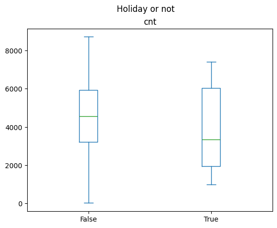
The means are, expectedly, quite different (holiday is much less than non-holiday). Now let’s see the distribution of each of the rental counts (cnts).
df_day_data[['holiday', 'cnt']].plot.box(by='holiday', title='Holiday or not')
cnt Axes(0.125,0.11;0.775x0.77)
dtype: object
from scipy.stats import ttest_indstat, p = ttest_ind(holiday_cnt, non_holiday_cnt, equal_var=False)print(stat, p)
-1.704685615800036 0.10299984047957059
The plot shows that the indeed during holiday, people tend to use less bikes. However, the non-holidays show less variance than holiday samples, but it’s due to the imbalance in the dataset. There really is much less holidays in 2 years than regular days. Hypothesis testing shows that with the usual p-value threshold of 0.05, we cannot reject the null hypothesis of two set of data coming from a same distribution.
EDA: Hourly data
Now, let’s investigate the hour.csv dataset. It contains a new column hr which makes the dataset suitable for investingating questions like: - During which hours people typically rent a bike the most? And which hours the least? - The pattern of daily hours, how does it look like?
df_hour_data = pd.read_csv("assets/bike+sharing+dataset/hour.csv", index_col='instant')df_hour_data['dteday'] = pd.to_datetime(df_hour_data['dteday'])df_hour_data = df_hour_data.astype({'holiday': 'bool','workingday': 'bool','season': 'category',# 'weekday': 'category',})print(f"Hourly data records and variables: {df_hour_data.shape}")df_hour_data.head()
Hourly data records and variables: (17379, 16)
dteday
season
yr
mnth
hr
holiday
weekday
workingday
weathersit
temp
atemp
hum
windspeed
casual
registered
cnt
instant
1
2011-01-01
1
0
1
0
False
6
False
1
0.24
0.2879
0.81
0.0
3
13
16
2
2011-01-01
1
0
1
1
False
6
False
1
0.22
0.2727
0.80
0.0
8
32
40
3
2011-01-01
1
0
1
2
False
6
False
1
0.22
0.2727
0.80
0.0
5
27
32
4
2011-01-01
1
0
1
3
False
6
False
1
0.24
0.2879
0.75
0.0
3
10
13
5
2011-01-01
1
0
1
4
False
6
False
1
0.24
0.2879
0.75
0.0
0
1
1
# Let's check if the first day, all hours average is given by the same record in the df_day_data fileimport datetimefirst_day = datetime.datetime(2011, 1, 1)df_first_day = df_hour_data[df_hour_data['dteday'] == first_day]df_first_day.head()
dteday
season
yr
mnth
hr
holiday
weekday
workingday
weathersit
temp
atemp
hum
windspeed
casual
registered
cnt
instant
1
2011-01-01
1
0
1
0
False
6
False
1
0.24
0.2879
0.81
0.0
3
13
16
2
2011-01-01
1
0
1
1
False
6
False
1
0.22
0.2727
0.80
0.0
8
32
40
3
2011-01-01
1
0
1
2
False
6
False
1
0.22
0.2727
0.80
0.0
5
27
32
4
2011-01-01
1
0
1
3
False
6
False
1
0.24
0.2879
0.75
0.0
3
10
13
5
2011-01-01
1
0
1
4
False
6
False
1
0.24
0.2879
0.75
0.0
0
1
1
For this one day, let’s calculate the average of the numerical columns.
numerical_cols = ["windspeed", "hum", "atemp", "temp"]cumulative_cols = ["cnt", "registered", "casual"]print(f"means of numerical cols: \n{df_first_day[numerical_cols].mean()}")print(f"means of cumulative cols: \n{df_first_day[cumulative_cols].sum()}")
means of numerical cols:
windspeed 0.160446
hum 0.805833
atemp 0.363625
temp 0.344167
dtype: float64
means of cumulative cols:
cnt 985
registered 654
casual 331
dtype: int64
# Check above output against the `day.csv`df_day_data[df_day_data["dteday"] == first_day][numerical_cols + cumulative_cols]
windspeed
hum
atemp
temp
cnt
registered
casual
instant
1
0.160446
0.805833
0.363625
0.344167
985
654
331
The values checks out. Not let’s plot the cnt for this first day to see the pattern of hourly bike rental rate.
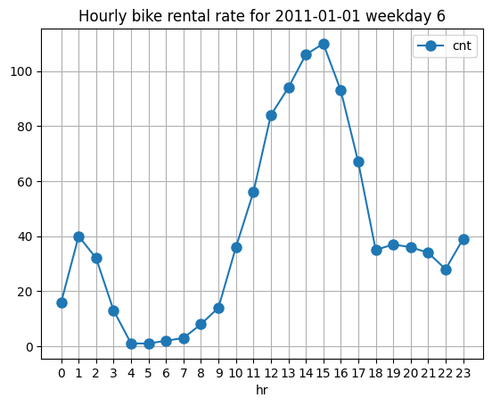
df_first_day.sort_values('hr').plot( x='hr', y='cnt', kind='line', marker='o', markersize=8, linewidth=1.5, title=f'Hourly bike rental rate for {first_day.date()} weekday {first_day.isoweekday()}', xticks=np.arange(0, 24, step=1), grid=True)
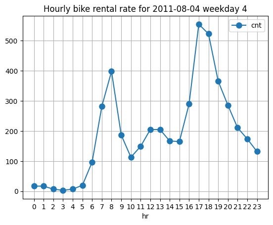
The peak demand (at least for the first day), seems to be from 12 to 16 with sharp decline up until 18 o’clock. It’s interesting that during the middle of a day, peak demand has occured. My initial guess was we would 2 peak hours one in the morning and the other after work. Perhaps due to this first_day was 6th day of the week, it is quite different. Let’s see another date from the weekday.
Yes, it’s quite interesting that this morning (before work) and afternoon (after work) pattern is seen in a date 2011-08-04 which was Thursday. Now the question is, does this pattern hold for every other workday and does previous weekend profile hold also for other weekends as well?
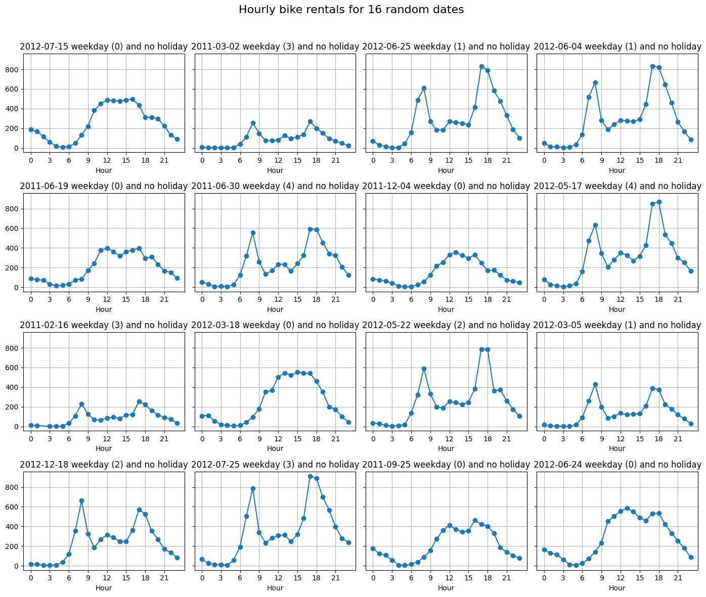
# Plot 16 random dates' hourly profiles in a 4x4 gridnp.random.seed(42)df_weekdays = df_hour_data[~df_hour_data['weekday'].isin([5, 6])]# need for unique because the dteday is same for every hour of a day.def plot_random_days(df):""" df: a df_hour_data or subset of it. """ unique_days = df['dteday'].dt.date sample_days = np.random.choice(unique_days, size=16, replace=False) fig, axes = plt.subplots(4, 4, figsize=(14, 12), sharey=True) axes = axes.flatten()for ax, day inzip(axes, sample_days): day_df = df[df['dteday'].dt.date == day].sort_values('hr') ax.plot(day_df['hr'], day_df['cnt'], marker='o', linewidth=1.5)# print(day_df['holiday'].all() )# print(day_df['weekday'].isin([6, 7]).all()) weekday = day_df['weekday'].iloc[0] ax.set_title(f"{day}{f"weekend ({weekday})"if weekday in ([5, 6]) elsef"weekday ({weekday})"} and {"holiday"if day_df['holiday'].all() ==Trueelse"no holiday"}") ax.set_xlabel('Hour') ax.set_xticks(range(0, 24, 3)) ax.grid(True) fig.suptitle('Hourly bike rentals for 16 random dates', fontsize=16) fig.tight_layout(rect=[0, 0, 1, 0.96]) plt.show()plot_random_days(df_weekdays)
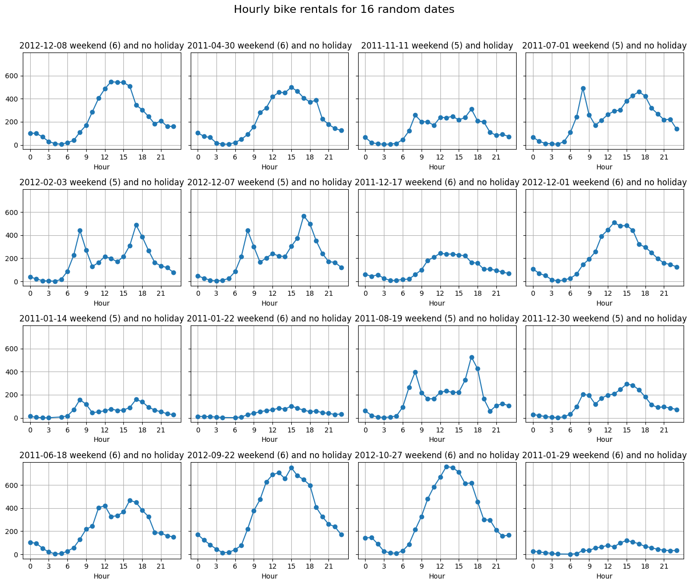
So, unfortunately, all of our 16 samples were weekdays. But most of the days show the abeforementioned two peaked hourly rate.
But let’s get 16 samples from the weekends and plot.
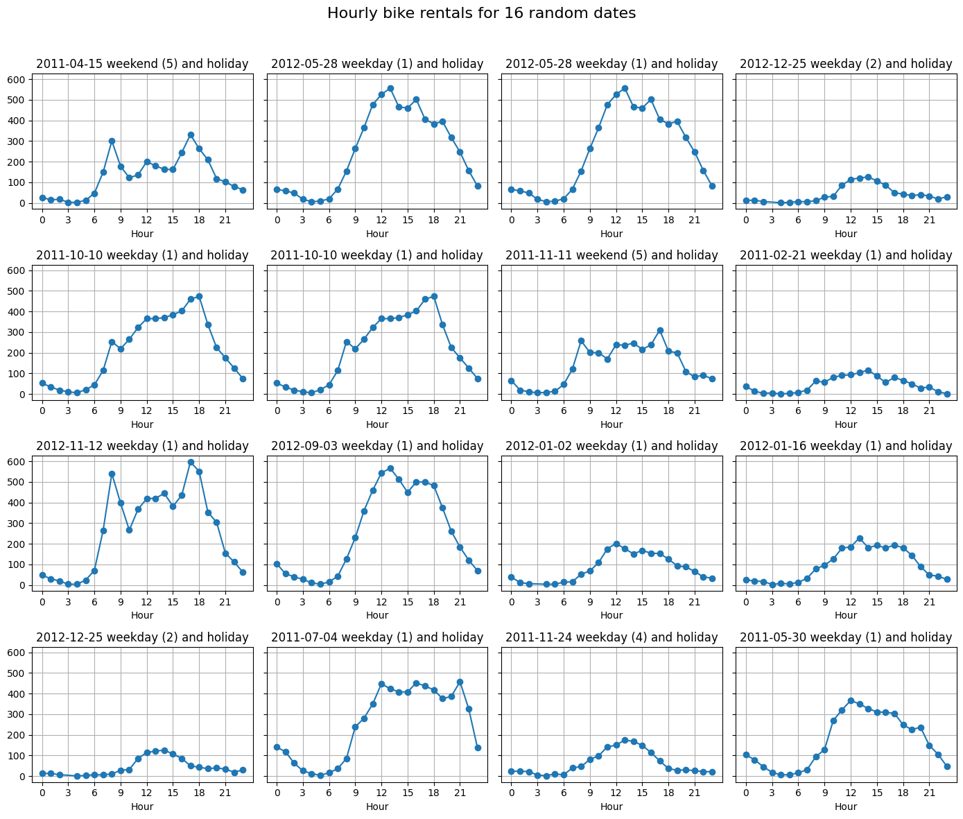
Now, let’s see the random 16 plots for the holidays. I guess the numbers would be very low. Since we only have 21 holiday days in our dataset we’re visualizing more than half of them.
Winter holidays seem to have a very low traffic except 2012-11-12. Fall and summer holidays have quite a lot of traffic. Season definitily is one of the biggest indicators of bike renting numbers.
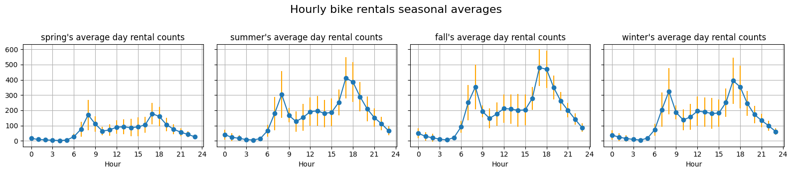
# Now on a more holistic and "on average" view apart from seasonal trends, how does weekends and weekdays differ? # Excluding holiday, and for each 4 season, let's plot the graph of what a typical day looks like for given season and plot the variance.# year == 2011df_hour_data_2011 = df_hour_data[df_hour_data['yr'] ==0]# always assume non-holiday unless said explicitly# df_weekdays_2011 = df_hour_data_2011[df_hour_data_2011['holiday'] == False && ][['dteday', 'hr', 'season', 'cnt']]df_weekdays_2011 = df_hour_data_2011.query('holiday == False and weekday < 5')def plot_seasonal_average(df):# groupby the season and compute the average count for each hour. group_seasonal = df.groupby(['season']) fig, axes = plt.subplots(1, 4, figsize=(16, 3.5), sharey=True) axes = axes.flatten() num_to_season = {1:'spring', 2:'summer', 3:'fall', 4:'winter' }for ax, (season_num, group) inzip(axes, group_seasonal): season = num_to_season[season_num[0]]# for each group we want to average them by hours df_hour_means = group.groupby('hr').mean(numeric_only=True) df_hour_std = group.groupby('hr').std(numeric_only=True) ax.errorbar(df_hour_std.index, df_hour_means['cnt'], marker='o', yerr=df_hour_std['cnt'], linewidth=1.5, ecolor="orange")# ax.errorbar(, df_hour_std['cnt'], color="magenta") ax.set_title(f"{season}'s average day rental counts") ax.set_xlabel('Hour') ax.set_xticks(range(0, 25, 3)) ax.grid(True) fig.suptitle('Hourly bike rentals seasonal averages', fontsize=16) fig.tight_layout(rect=[0, 0, 1, 0.96]) plt.show()plot_seasonal_average(df_weekdays_2011)
/tmp/ipykernel_597596/1384765348.py:12: FutureWarning: The default of observed=False is deprecated and will be changed to True in a future version of pandas. Pass observed=False to retain current behavior or observed=True to adopt the future default and silence this warning.
group_seasonal = df.groupby(['season'])
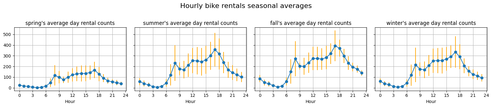
# year == 2011df_weekends_2011 = df_hour_data_2011.query('holiday == False and weekday >= 5')plot_seasonal_average(df_weekends_2011)
/tmp/ipykernel_597596/1384765348.py:12: FutureWarning: The default of observed=False is deprecated and will be changed to True in a future version of pandas. Pass observed=False to retain current behavior or observed=True to adopt the future default and silence this warning.
group_seasonal = df.groupby(['season'])
These weekdays and weekends distinction reveals that, aside from seasonal trends, weekends tend to be much more varied than weekdays. For seasonal trends, during spring, not much people uses bike rentals compared to other seasons. Also, due to work, weekdays tend to have much less traffic during work hours, namely from 10am to 15am.